Damar Aji Pramudita

Portfolio

Film or Digital
Breaking Down Hollywood's Choice of Shooting Medium
Data Storytelling
D3.js
Python
Project Screenshot Project Screenshot Project Screenshot
Project Description
In this visual essay written for The Pudding, I digged into IMDb data to explore the filmmaker choices of shooting medium. I tried to understand when did a director choose one technology over the other, and whether it's related with the movie genres or the movie budget.
Process
Idea Conception
First, The Pudding team suggested to find topic that I’m passionate to. In the end, I come up with idea to explore film vs digital debate in the cinema industry.
Data Collection and Cleansing
In this phase, I collected raw data from IMDb and do some data cleansing.
Exploratory Analysis
Once the data are available, I explore the data using SQL and Python, looking for interesting pattern they might reveal
Data Visualization Design
Next, I designed the visualization to complement the story.
Implementation
Finally, I built the data visualization in a web page format using D3.js and React.
Global Fishing Location
Visualizing foreign fishing activities
Data Visualization
D3.js
Python
Project Screenshot Project Screenshot Project Screenshot
Project Description
This project was created as a submission to Data For A Cause, a challenge to create data visualization for a not-for-profit organization. In this edition the participants are asked to visualize global fishing activities done in foreign country territories, based on data provided by Global Fishing Watch.
Process
Data Cleansing
In this phase I aggregated around 6 million rows of fishing activities data provided by Data For A Cause based on the ship’s origin country and the fishing territory, so it would be easier to analyze and visualize in the next phase.
Data Visualization Design
Data for A Cause has provided a brief for the project, that is to highlight rich country fishing activities in poorer county territory. So in this phase I think about the best visualization format for that purpose. In the end I decided to build and interactive map that shows location and duration of fishing activities spend by a country.
Implementation
Build the data visualization in a web page format using D3.js and React.
Tracing the K-Pop Wave
Visualizing Google Trends Data for Famous K-Pop Groups
Data Storytelling
D3.js
Python
Project Screenshot Project Screenshot Project Screenshot
Project Description
This personal project started when I saw BTS, a K-Pop boyband, became a major hit in the US by the end of 2017. K-Pop was already a hit in Indonesia since 2012, so I wonder if the K-Pop wave are rising differently in the US and other countries. This curiousity led me to analyze Google Trends data trying to find the answer.
Process
Data Collection and Cleansing
I wrote a Python scripts to collect Google Trends data for various K-Pop bands in several countries.
Exploratory Analysis
I plotted the data in Microsoft Excel to see how K-Pop are rising in different countries, and chose five countries with the most interesting pattern: Indonesia, US, China, Thailand, and Japan.
Data Visualization Design
Main challenge at this phase were choosing a color palette to represent 35 artists in the visualization. I used chroma.js to help me build a color scale.
Implementation
I built the data visualization in a web page format using D3.js and React.
Digital Mind Standardization
Discussing ethical aspect of technology through art
Data Art
Processing
Project Screenshot Project Screenshot
Project Description

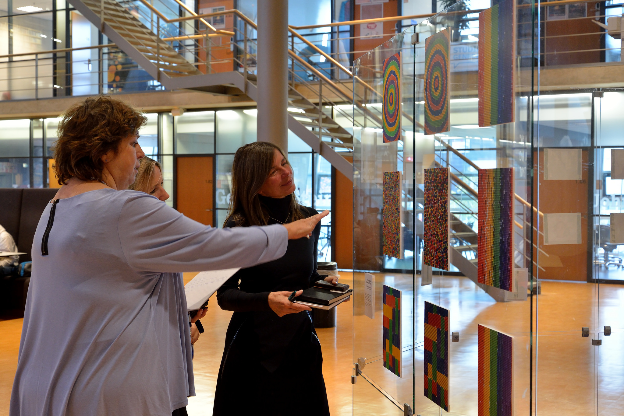
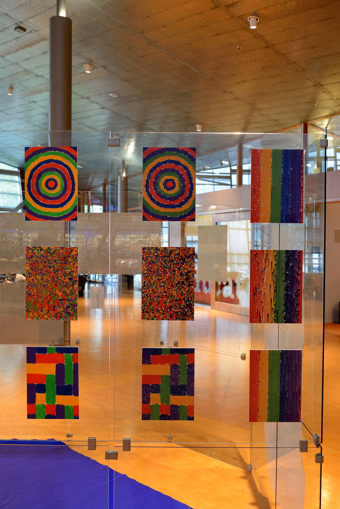
This work was created as part of Impact!, a workshop organized by my campus to discuss ethical aspects of technology and expressed them through art.

In this project, I tried to show how technology can be used to organized people works to be more standardized and structured. On one hand, this will lead to increase productivity and more profits. But on the other hand, it may come with a cost of standardizing human's mind.

To illustrate this, I painted three different paintings and use Processing to sort each pixel by its color, resulting in final paintings which are very similar to each other.

Is La La Land's Ending Hopeful or Despairing?
Visualizing La La Land's emotional roller coaster
Data Storytelling
D3.js
Python
Project Screenshot Project Screenshot
PROJECT DESCRIPTION

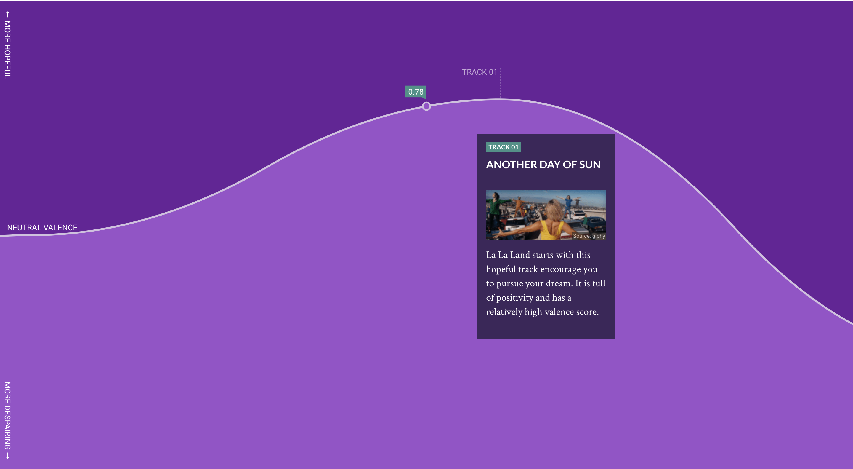
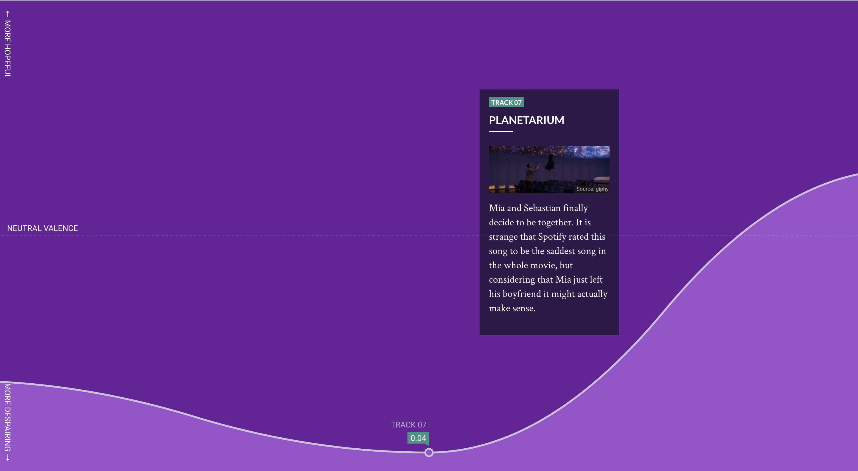
I used Spotify API to collect audio data from songs used in La La Land to answer an important question: is La La Land's ending hopeful or despairing?

The answer was then visualized as a roller coaster track, representing the emotional ups and downs the movie has taken us on.